
Editor Builder
34 min
Overview of the Editor Builder
In Essential, an Editor provides users with a high-level User Interface (UI) for selecting and editing instances of a specific class. For example, a Technical Application Editor could be used by Solution Architects to edit the technical aspects of instances of the Composite Application Provider class, where a Business Application Editor could be used By Business Analysts to edit slots related to the functionality and business usage of Composite Application Provider instances. The Editor Builder helps you design and build your own custom Editors to suit your needs as an organisation or user.
Before starting any build of an Editor, we recommend that you clearly understand the class of the instances that you would like your Editor to maintain (e.g. Composite Application Provider, Technology Product, Business Process) and the slots of that class that are in scope. With this, you should create a draft or sketch that maps out how the Editor will look, considering the Editor Components you will use and any requirements regarding their placement and layout.
If you are unsure of what you want your Editor to look like, or what an Editor is made up of, read this document to understand the library of components that are currently available and to make sure you know how they work and any of their limitations before you start designing.
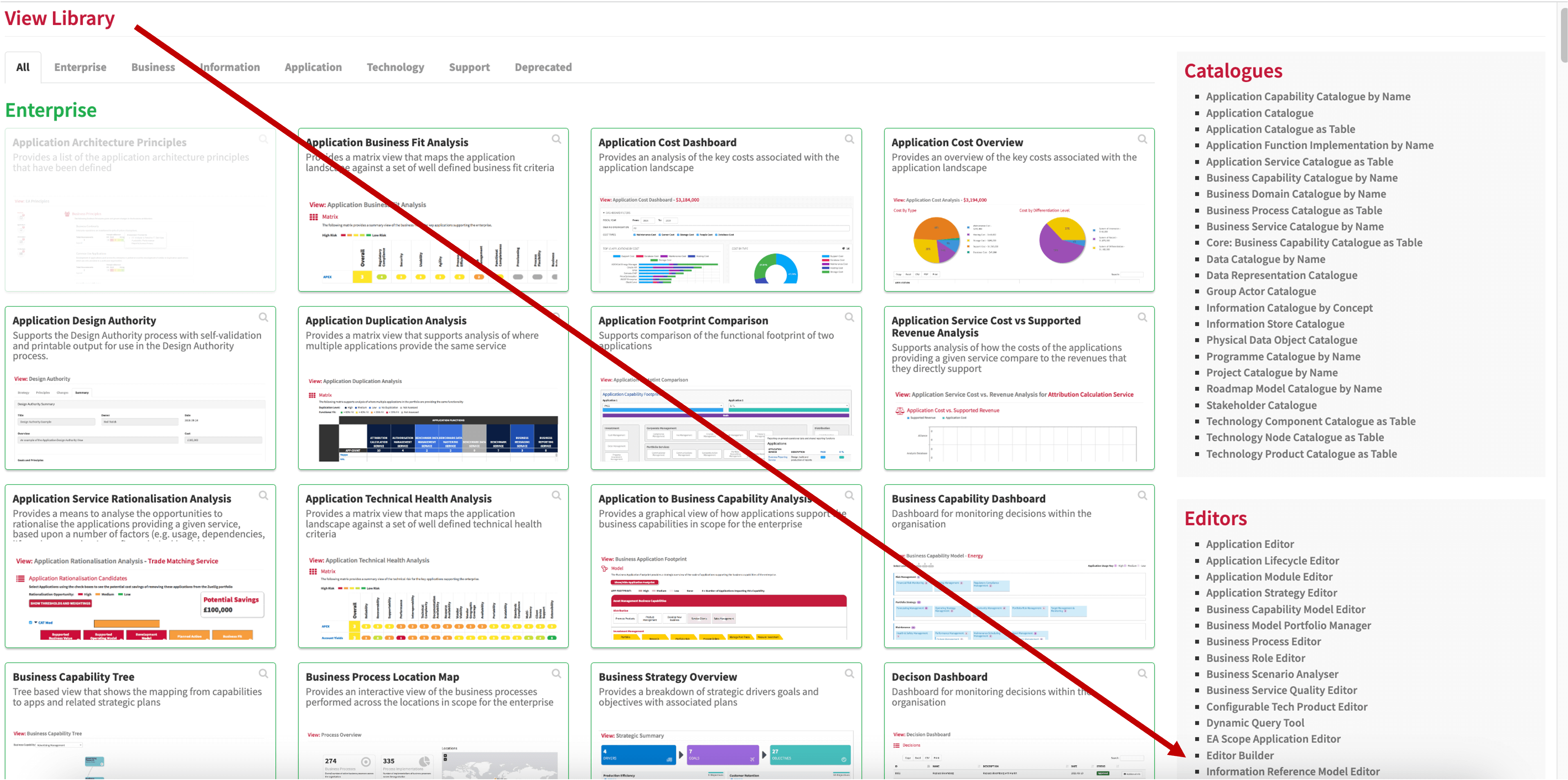
The View Library also provides a set of pre-configured editors that you can use and edit to meet your own requirements. As of release 6.19 there are 18 pre-configured editors you can select from.
Accessing the Editor Builder
You will find the Editor Builder in your Editors List in the View Library. If it is not there, it may need enabling which can be done from the EDM Capture screen or using the Viewer Configurator.
Enabling the Editor
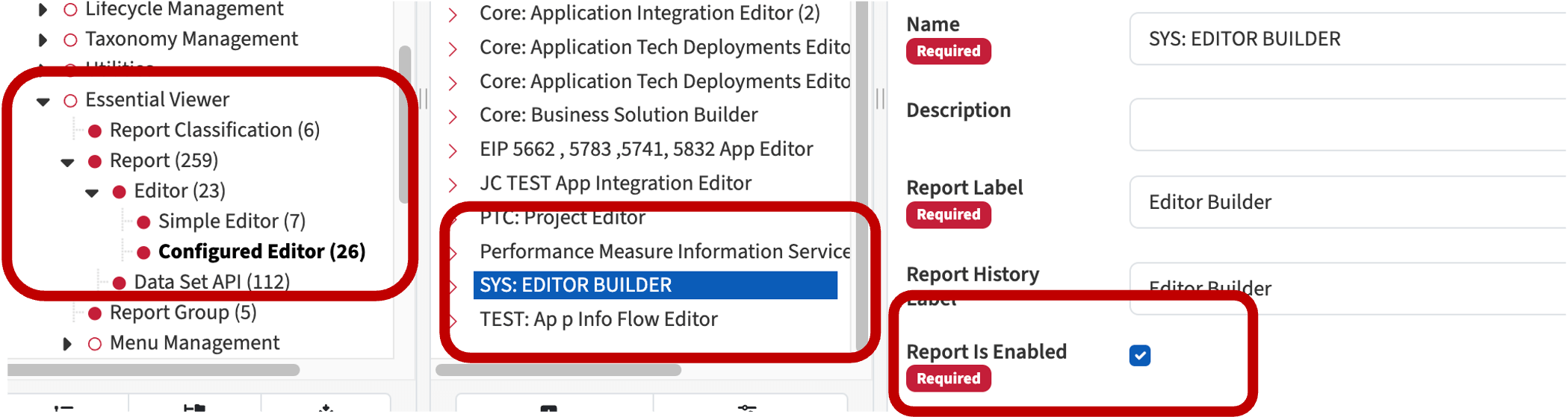
Using Capture
From Capture, go to EA Class > EA Support > Essential Viewer > Report > Editor > Configured Editor. Then select SYS: EDITOR BUILDER from the list in the instance browser.
Using the Viewer Configurator
You can also enable it from the Viewer Configurator. Open the Viewer Configurator from the View Library > Support.
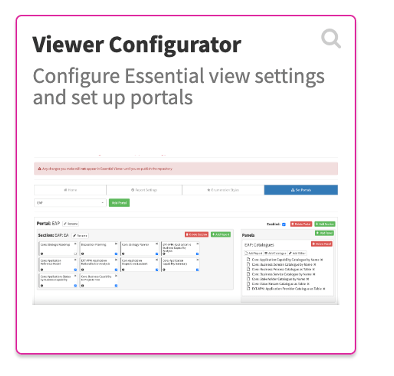
Go to ‘Set Portals’ and in the Editors tab, add the Editor Builder.
Once you have done either of these, perform a publish from your repository to promote the changes to the Viewer.
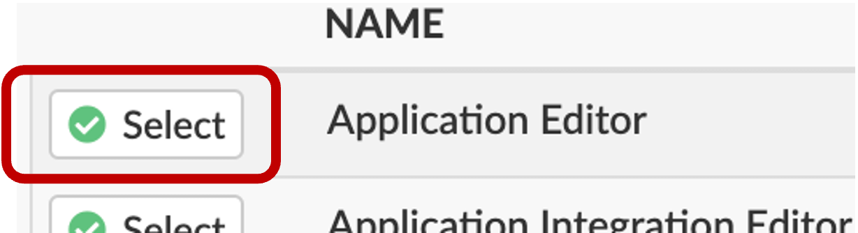
Once you are in the Editor Builder, it will display the Editors that you have already created. Here is where you can access any previously created Editors—just click the Select button to the left of the one you want to access.
You have a number of choices:
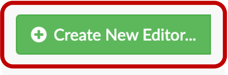
- To start building a new Editor, click the Create New Editor button
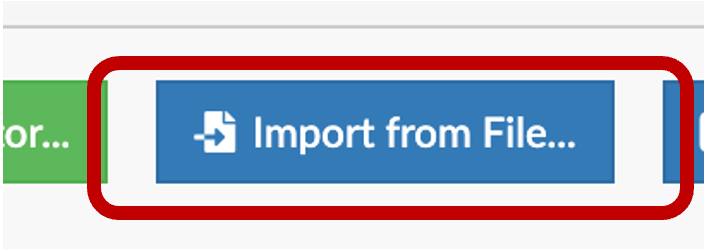
- If you want to use an existing Editor as a starting point, you can click Import from File
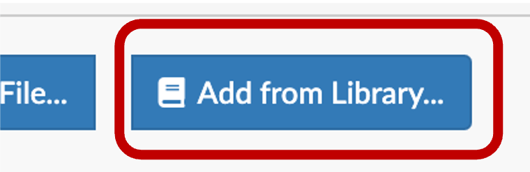
- Add from Library, i.e. use a preconfigured editor from EAS
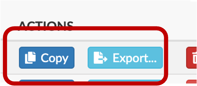
- Click Copy button associated with an Editor in the list to duplicate an editor
Structure of an Editor
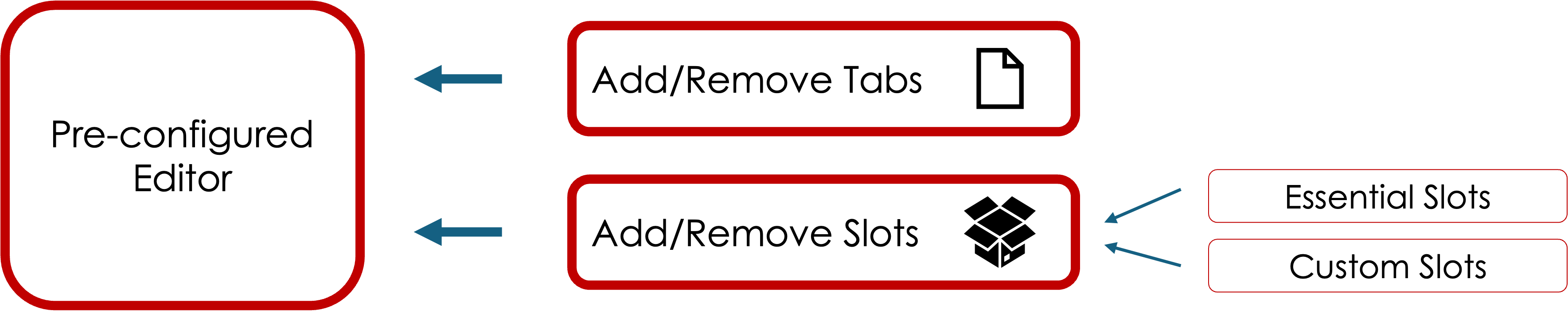
All Editors are made up of the same basic types of Editor Component: Tabs, Sections, Panels, and Widgets
Default screen after creating a new Editor

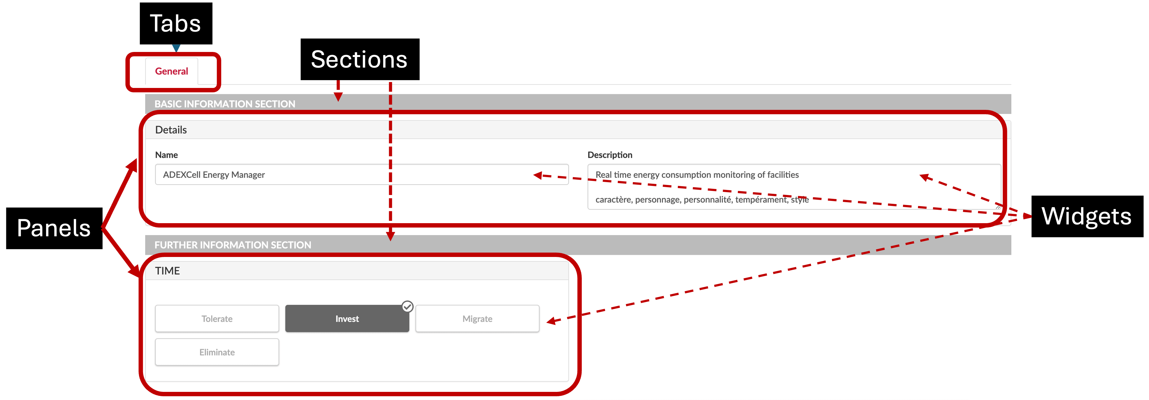
Tab: An Editor can have different Tabs to focus the capture on different areas, for example a summary tab, a cost tab etc. These are shown at the top of an Editor and each tab can contain sections and panels. You can have an Editor that has only a single tab. EAS have provided some pre-configured tabs that can be brought into an editor, for example, the cost tab.
Section: Each Tab can be divided into Sections, to allow focus on a specific area of capture. Sections can contain Panels. A Tab can contain just a single Section, or many. If a Section is given a heading it will appear, if no heading is added it will be invisible. You may want to do this to force a split of the Panels shown in a Section without an explicit visible marker. Sections are full screen width. Note: you do not need sections if you don’t wish to have them.
Panel: Each Section can be divided into Panels, which hold the Widgets that allow the data to be captured and maintained. A Section can contain just a single Panel, or many. Panels can be set to specific screen widths, so you could have two half width Panels side by side in a Section. If a Panel is given a heading it will appear, if no heading is added it will be invisible. You may want to do this to force a split of the Widgets shown in the Panel without a visible split, for example if you have four half page Widgets but you want the fourth to be on its own line you could add a panel to force it.
Widgets: These are the data capture elements and are things such as radio buttons, drop-down select boxes, etc.
Creating an Editor
When you create an editor, you are selecting a class and then adding slots or relationships from that class to build up a data capture form for users to use.
In the Editor Catalogue, click Create New Editor:
You will be presented with this screen:
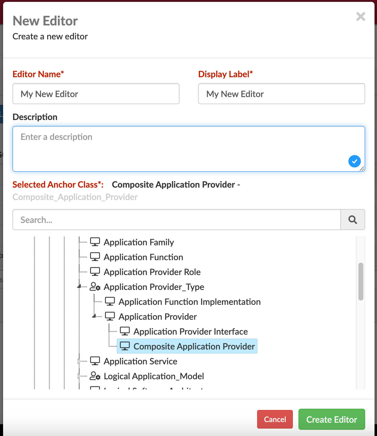
Here you will name your editor and select the anchor class, i.e. the class upon which the editor should be built, e.g. the Business Capability or the Composite Application Provider class. Then click Create Editor
Now you will start to add the tabs, sections, panels and widgets for your editor
Default screen after creating a new Editor
At the top level in the Editor Components panel is the editor you created, click that and you have up to 4 tabs; General, Data, User Interface, and Labels. Use this to configure how the user will interact with the editor, e.g. can they delete instance, it is enabled in the library, what labels should the user see, etc. Below is an example of the tabs from the main Editor Component that you see after creating an editor.
General Tab

This holds general information about the Editor (or Editor component), completed during the creation of the Editor, but can be updated as is required. You can also enable the Editor from this tab.
- Editor Name – Internal name for the Editor
- Editor Description
- Editor Enabled – defines whether the Editor is enabled and will appear in the Editor list in the view library
- Editor Label – The display name
Data Tab
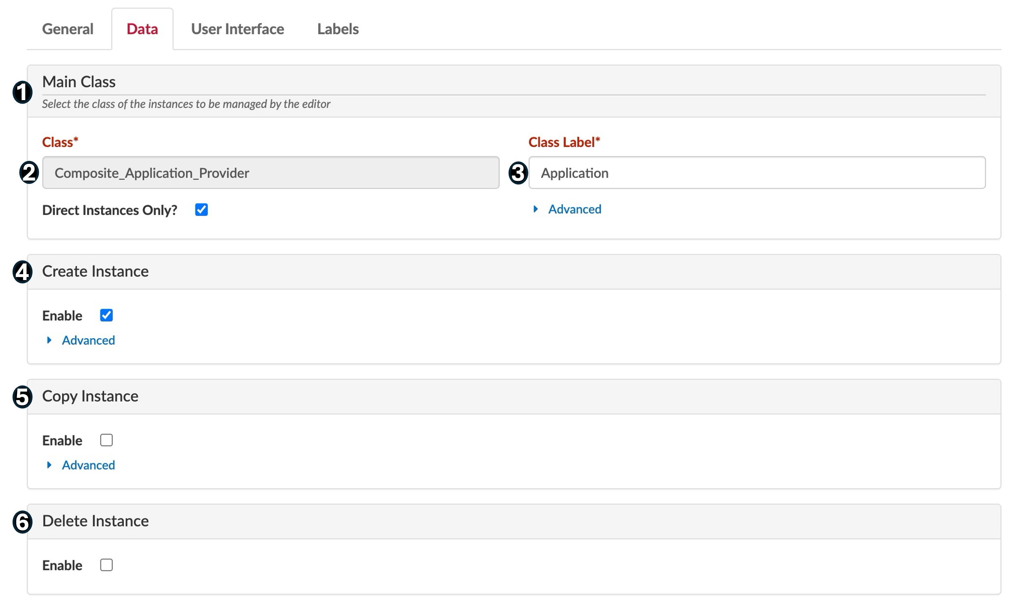
This will vary for each Editor component, but contains details about the selected Editor Component
This displays the anchor class, i.e., the class that the Editor will be updating. You can also select whether a user can create, copy, and delete instances. For example, when the editor is anchored to Composite_Application_Provider, users would be able to create, copy, or delete applications.
- Main Class
- Class – The Class managed by the Editor.
- Class Label – How the Class appears in the Class Tree.
- Create Instance – Defines whether you can create an instance using the Editor with the option to use a template path when you create new instances.
- Copy Instance – Defines whether you can copy an instance using the Editor with the option to use a template path when you copy new instances.
- Delete Instance – Defines whether the Editor can delete an instance.
The advanced drop down offer additional options:
API Filter Expression: this allows you to pre filter the instance returned to the editor, use the DQT to test and define a query
Copy Depth and Copied Slots define the depth of the copy and the slots you want to be copied between instances, e.g. name, description, lifecycle_status_application_provider and do you want copy to be just this instance or this instance and all instances referenced to it (and their references, etc). Note think this through carefully if you copy deeper than 0 which is just this instance.
Define a template: this allows you to define a template to reuse in lots of editors which you can use to speed up your Editor building process if you are going to be creating numerous Editors. This requires a JSON structure to be dropped in the user folder
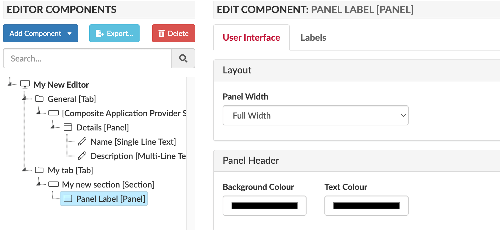
User Interface Tab
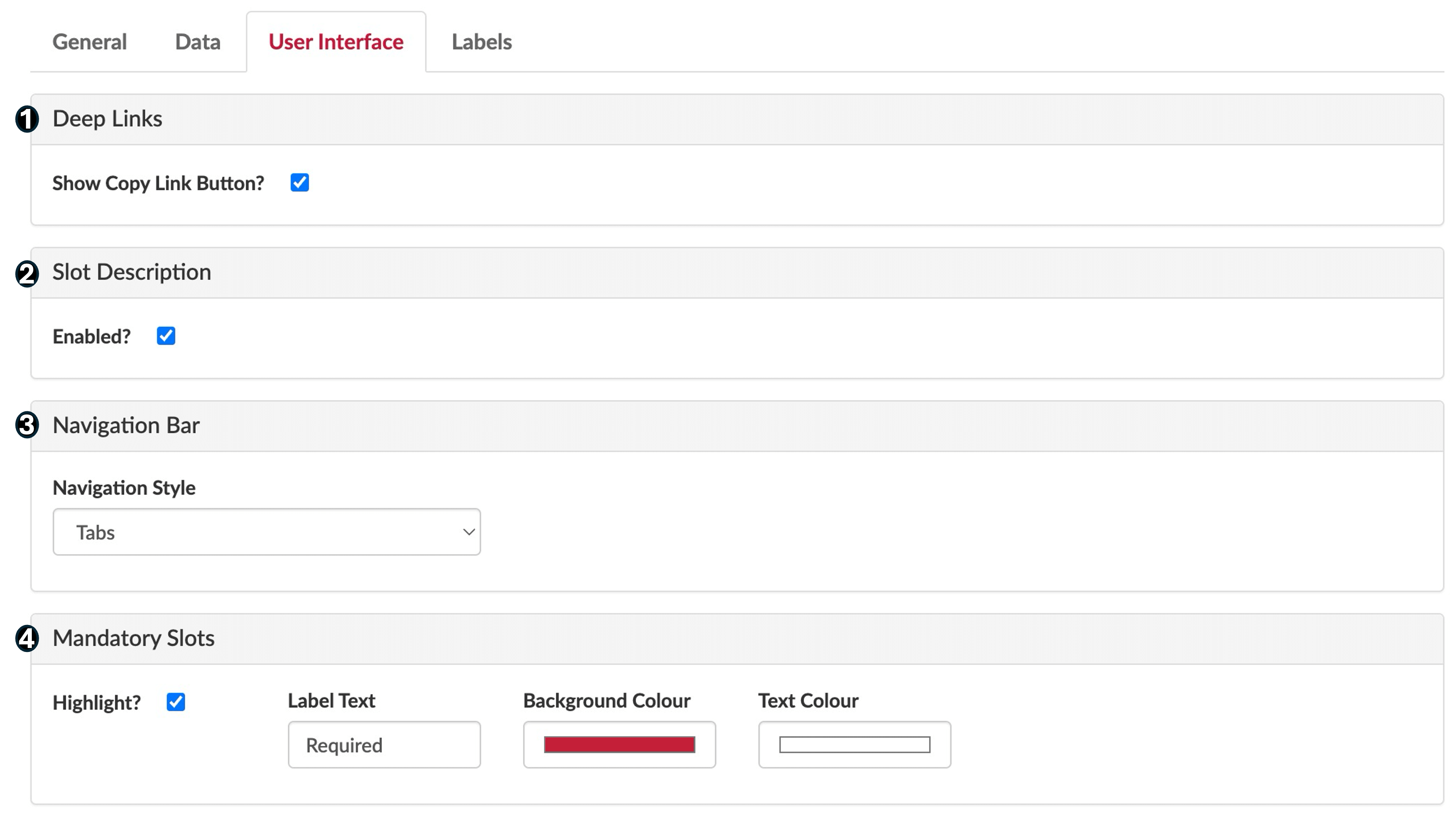
This is where you decide what the Editor Components will look like in the Editor. For the main Editor you’ll get deep links and navigation bar options, but generally components will have column width, slot description, and highlight if mandatory options.
- Deep Links – Defines whether you can copy a link to the Editor. You can use this to send direct links to other users and give them a direct route to the Editor
- Slot Description – Define if slot descriptions are shown on hover in the editor.
- Navigation Bar – Choose the style of tabs that you will navigate the Editor tabs with, choose from: Tabs, Chevrons, Pills.
- Mandatory Slots – Allows you to choose whether to highlight mandatory slots, select the wording and the colour of the prompts.

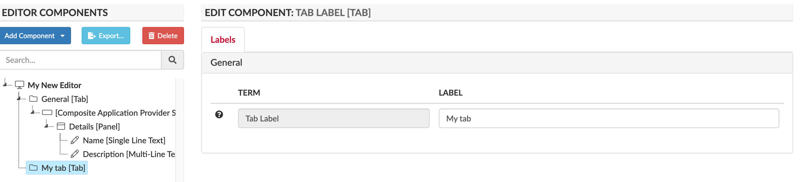
Labels Tab
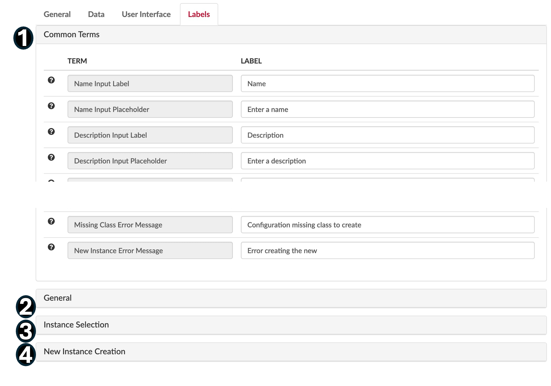
Labels allow you to customise the editors with your own terms that may be more familiar with your users. The ‘Terms’ column has set values that you cannot edit.
-
- Common Terms – Basic terms for labels when using the Editor that you can customise if desired.
- General Terms and Labels for your Editor, e.g. Editor Title, Access Denied Text
- Instance Selection – Terms and labels for selecting instances, e.g. Select, Copy, and Delete button labels.
- Instance Creation – Terms and Labels for instance creation, e.g. New Instance Button Prefix “Create New.”
Configuring the Layout of an Editor
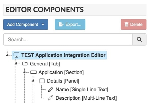
When you create a new Editor, a General tab is automatically loaded into the Editor Components Definition Hierarchy Area for the anchored class you selected. There will also be a Section and Details panel with Name and Description.
Setting Section and Panels
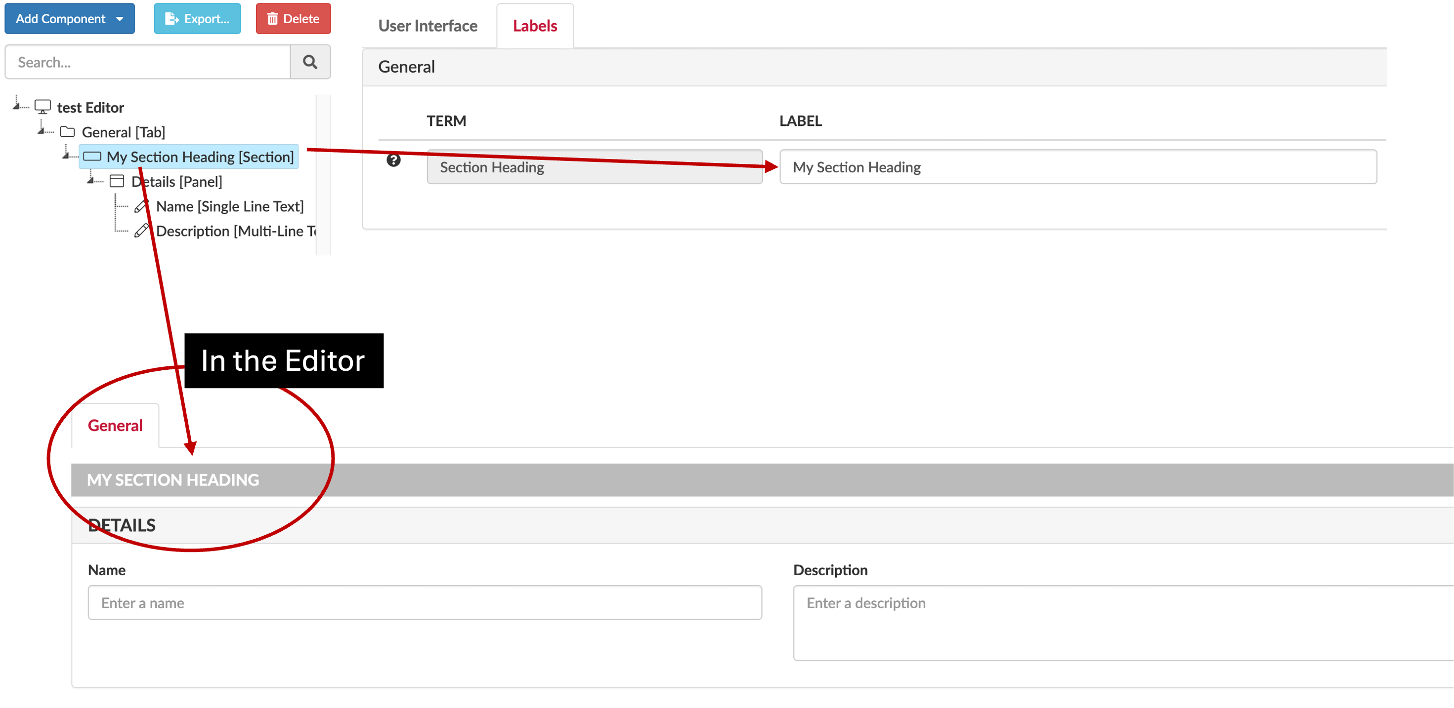
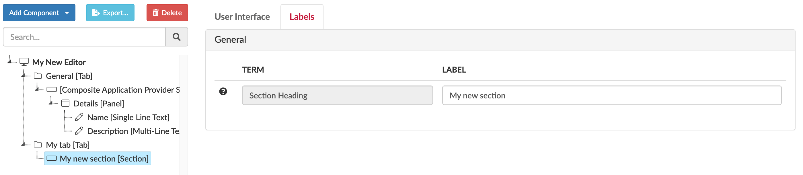
You will need to name any Sections or Panels created or they will not show up in the Editor, even if they are listed as a component. Do this by clicking the section or panel and then update the name in the Labels tab.
You can add as many panels and slots to a section as you need, but note adding too many to one section may make it more complicated than is necessary. Note a section is not strictly neccessary, you could just have panels, but it can be better when you have lots of widgets as it gives better context.
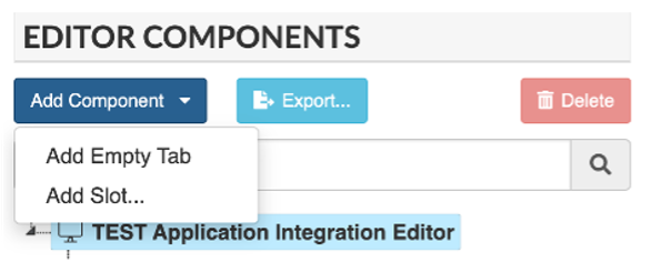
Adding a Tab
A tab will hold our widgets. To do this click Add Component and select Add Empty Tab
You can add and customise an empty tab, or there are some preconfigured tabs you can choose from, preconfigured tabs are tabs that have predefined functionality, e.g. Application Dependencies, Costs.
For Custom (empty) Tabs, select the Editor’s name from the component list, then Add Component, and Add Empty Tab. Name the Tab, usually related to the data that will be edited from this Tab.
For Preconfigured Tabs – select ‘Add Slot’ when adding a new component.
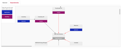
For example, see below, selecting the ‘Application Dependencies’ slot means you can either select the Application Dependencies Tab or the Application Information Flow Tab. Other pre-configured tabs include the Costs Tab and Change Records Tab.
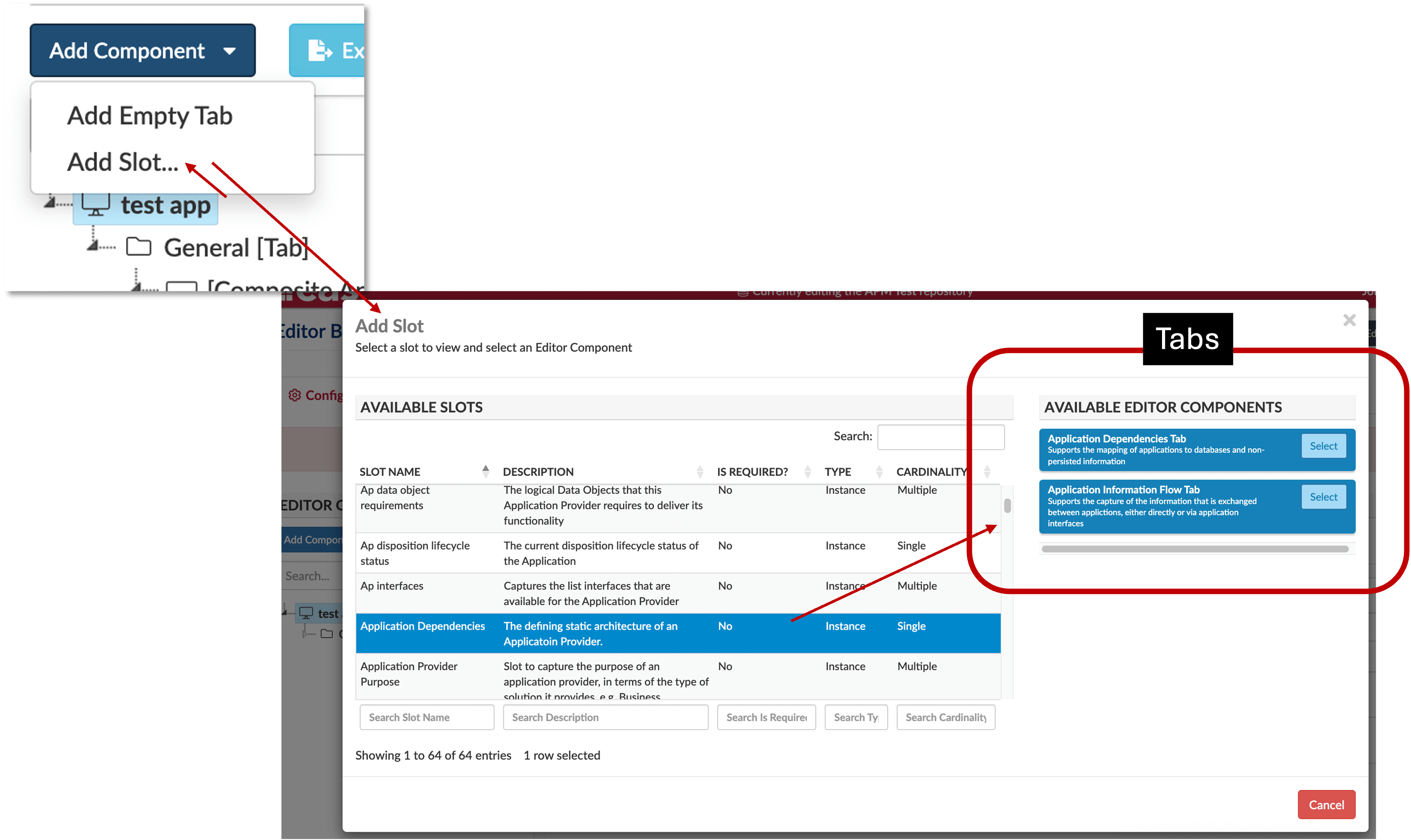
Here the Application Dependencies slot has two tab options, Application Dependencies Tab, and Application Information Flow Tab, you could select either for your editor
 or
or 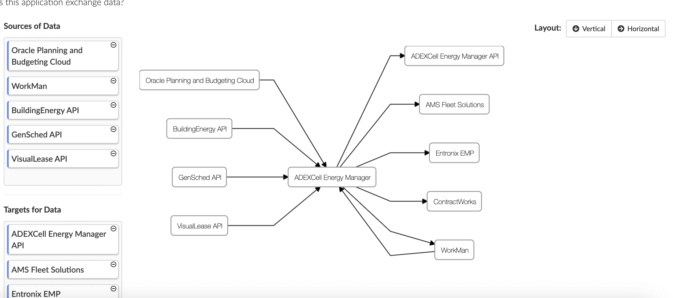
Adding a Section
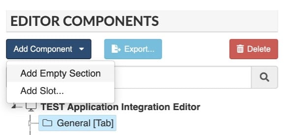
To add an empty section, select the Tab you want the Section to appear in from the component’s menu. Select Add Component and click ‘Add Empty Section.’ Sections contain the panels that hold your widgets. You can customise a section’s colours, icon, and display label.
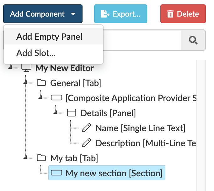
Adding a Panel
You can add blank (or empty) panels or pre-configured slots depending on what you need, Blank panels allow you to completely customise the slots in the panel.
The panel width determines how wide the panel should be in the editor, from full width (of the panel), to 1/6th of the editor, plus you can set the colours to use in the panel.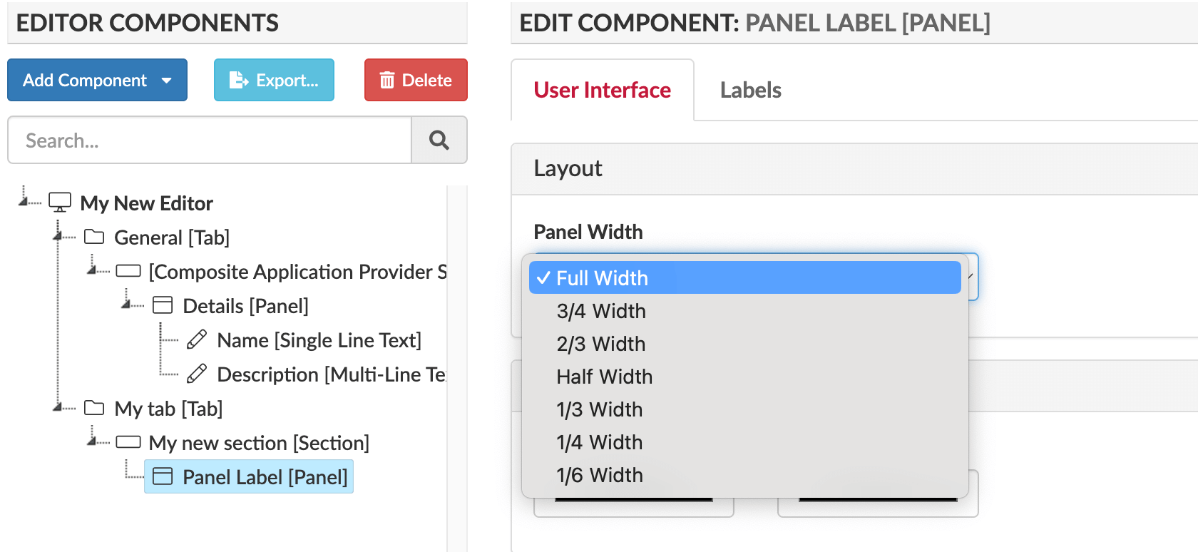
Adding Slots
These are where you will find the ‘widgets’ for maintaining data. The slots are linked to slots in the anchor class. If you have added your own slots to the class they will be here too.
Note: there is a need to register a slot before it appears in the editor list, to do this, in the class editor in the Back-end Data Capture, after creating the slot, just open the layout panel by clicking the layout tab.
Selecting a slot will give you a list of possible components that you could use. Typically, the components presented will depend on the type (e.g. String, Integer, Instance) and cardinality (e.g. single, multiple) of the selected slot. However, in some cases, the components presented have been created specifically for the slot (e.g. Application Dependencies Tab for ap_static_architecture slot).
Note that the lowest-level widget components (e.g. Integer Input, Single Line Text, Date Picker) can only be added if the editor contains at least one empty Panel component. The Editor Builder will show an error if this is not the case.
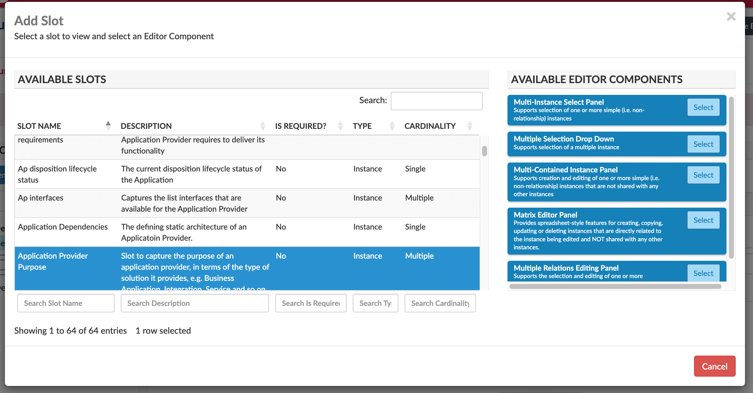
Once you have selected a slot, there will be one, or numerous widgets to choose from. These will define how the data is displayed when you are maintaining data via the configurable Editor. These are the most customisable aspects of the builder.
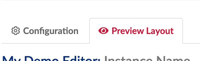
You can add as many Tabs, Sections, Panels, and Slots as you need, and you can use the Preview Layout tab to take a quick look at what your editor will look like, but you will have to publish your repository to see your editor in the View Library and for any changes to be applied.
Create or Maintain Existing Data in Essential – Sharing Editors
You can share your created Editors with other users, there are two ways of doing this.
Right click on the Editor you want to share from the Editor list in the View Library, then select copy link and send that to the required users.
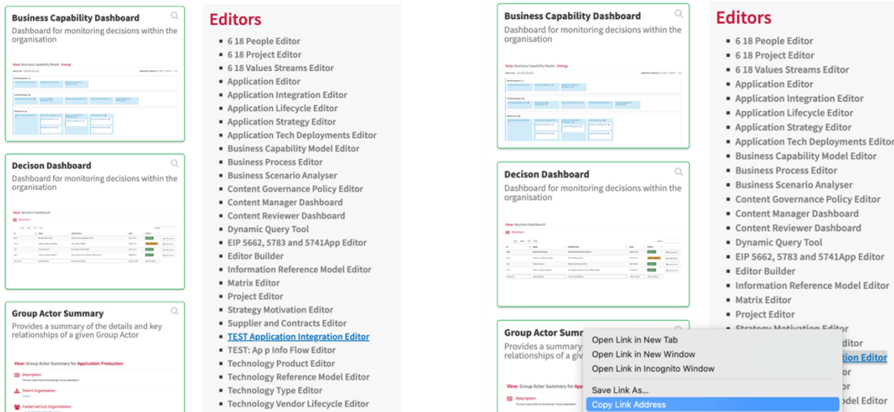
This is a more specific way of sharing. Go into the Editor and select the instance you want to be edited from the list. Once you are in the editor, there will be a “Copy Link” button in the top right, this is what you will send to the user that is going to edit the data for this element.

Uploading Editors from the Library
EAS provide a whole suite or pre-configured editors in the editor library. You can upload these Editors from the library in the Editor Builder homepage, e.g. the Application Integration Editor
1. Open the Editor Builder
2. Click Add from Library button
This modal will open:
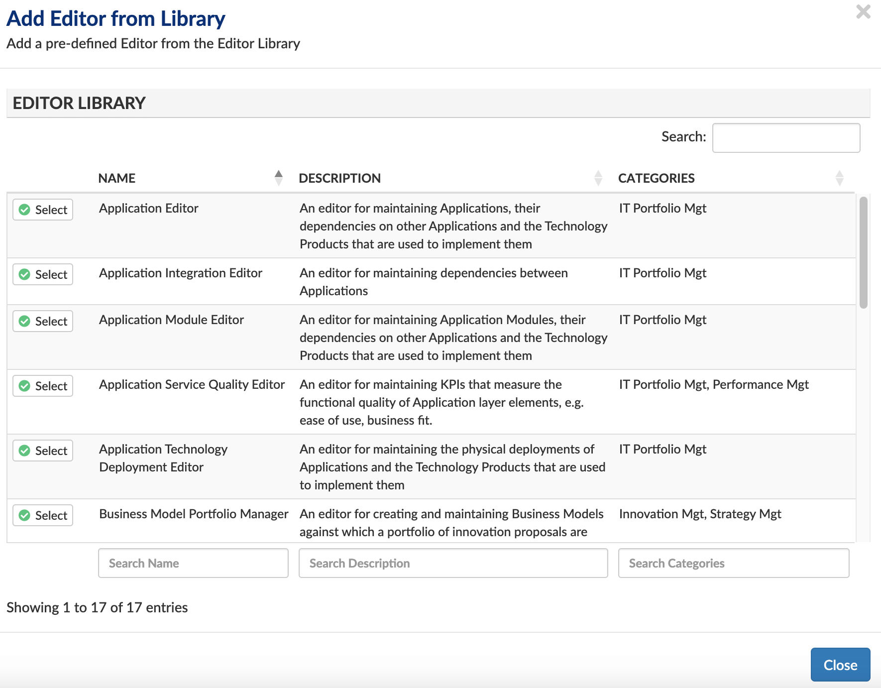
3. Select the editor to add
4. Now publish the repository
You can copy pre-configured Editors from the Library provided by EAS and then add specific elements to them, or if there are slots you never have data for, remove them, or create a new Editor without them to tidy up your workspace. The overall aim is to make the experience of creating and maintaining data in Essential better and more efficient for users.
Editor Components (6.19)
Below are a list of components, and widgets (the term we use for the lowest-level components, e.g. Single Line text, Date Picker which can be contained within a Panel).
| Name | Description |
| Performance Measure Sections Editor Component | Sections that support the capture of performance measures of an instance |
| Multiple Relations Editing Panel Editor Component | Supports the selection and editing of one or more relationship instances as well as the instance at the other end of the relationship |
| Change Activity Strategic Plans Panel Editor Component | A Panel component that supports the mapping of Strategic Plans and their Planned Changes to Change Activities, i.e. Projects etc. |
| Idea Reference Model Impact Tabs Editor Component | Creates one or more tabs, each of which allows a user to capture the Impacts that an Idea Option has on elements with a given Reference Model, e.g. Business Capability Model, Technology Reference Model |
| Value Stream Stages Panel Editor Component | Supports drag and drop editing of the Value Stage hierarchy of a Value Stream |
| Service Quality Measures Sections Editor Component | Sections that support the capture of service quality measures of an instance including comments for each service quality value measured |
| Multi-Contained Instance Panel Editor Component | Supports creation and editing of one or more simple (i.e. non-relationship) instances that are not shared with any other instances |
| Multiple Multi-Line Texts Panel Editor Component | Supports editing of a multiple cardinality string property, with each entry being one or more longer sentences |
| Integer Slider Input Editor Component | Supports editing of a single cardinality integer property using a graphical slider |
| Matrix Editor Panel Editor Component | Provides spreadsheet-style features for creating, copying, updating or deleting instances that are directly related to the instance being edited and NOT shared with any other instances. |
| Idea Principles Compliance Assessments Section Editor Component | Supports the capture of principle compliance assessments against an Idea |
| Decisions Tab Editor Component | Supports the capturing of one or more Decisions against an instance |
| Idea Value Proposition Tab Editor Component | Supports the capturing of a single Value Proposition for an Idea |
| Business Model Ideas Portfolio Tab Editor Component | Supports the management of the portfolio of ideas associated with a given Business Model |
| IT Standards Panel Editor Component | Supports the capture of Application and Technology Standards |
| Description Text Editor Component | Uses AI to suggest descriptions for instances |
| Single Line Text Editor Component | Supports editing of a single cardinality string property |
| Single Selection Drop Down Editor Component | Supports selection of a single instance |
| Multi Line Text Editor Component | Supports editing of a long, single cardinality string property |
| Default Tab Editor Component | The default component for Editor tabs |
| Default Panel Editor Component | The default component for Editor panels |
| Default Row Editor Component | The default component for Editor rows |
| Radio Buttons Panel Editor Component | Supports selection of a single instance |
| Multi-Instance Select Panel Editor Component | Supports selection of one or more simple (i.e. non-relationship) instances |
| Multi Selection Drop Down Editor Component | Supports selection of a multiple instance |
| Stakeholders Panel Editor Component | Supports setting of individual or organisational stakeholders against an instance |
| Date Picker Editor Component | Supports editing of a single cardinality date property |
| Month Picker Editor Component | Supports editing of a single cardinality date property by selecting a month of a year |
| Year Picker Editor Component | Supports editing of a single cardinality date property by selecting a year |
| Integer Input Editor Component | Supports editing of a single cardinality integer property |
| Float Input Editor Component | Supports editing of a single cardinality float property |
| Boolean Panel Editor Component | Supports the setting of a Boolean value to true, false or unknown |
| Application Dependencies Tab Editor Component | Supports the mapping of applications to databases and non-persisted information |
| Application Deployments Tab Editor Component | Tab component for managing application deployments |
| Lifecycle Panel Editor Component | Supports the maintenance of a single Lifecycle Model |
| Costs Tab Editor Component | Tab component for defining the costs associated with an element |
| Filtered Single Selection Drop Down Editor Component | Supports selection of a single instance where the list of allowed instances can be filtered |
| Performance Measure Tabs Editor Component | Tabs that support the capture of performance measures of an instance |
| Application Information Flow Tab Editor Component | Supports the capture of the information that is exchanged between applications, either directly or via application interfaces |
| Document Links Panel Editor Component | A panel that supports the creation of external document links |
| Organisation Business Architecture Tabs Editor Component | Collection of tabs that support the definition of the business and IT architecture for a given Organisation |
| Application Business Usage Panel Editor Component | A Panel component that supports the mapping of Applications to the business processes performed by organisations |
| Filtered Multi Selection Drop Down Editor Component | Supports selection of a multiple instances where the list of allowed instances can be filtered |
| Strategic Plan Changes Panel Editor Component | Supports the definition of the changes that are intended for a given Strategic Plan |
| Element Styling Panel Editor Component | A Panel component that supports the setting of colours, styles and icons for any element |
| Yes No Panel Editor Component | Supports the setting of specific Symbol slots to Yes, No or Unknown |
Updated 11 December 2023